 |
The sad state of municipal logos in Canada
 |
If Canadian cities are serious about attracting top-notch talent, investment and business, they should take a look at their logos, says a leading national designer.
“Municipalities have begun to think of themselves as brands and they realize they have to compete with other cities all over the world for residents, entrepreneurs and attention,” says Hunter Tura, CEO of Toronto-based Bruce Mau Design.
While other jurisdictions — Tura cites Melbourne, New York and Sao Paulo — have unveiled modern, eye-catching emblems, Canadian cities appear to be lagging behind.
“Taken in aggregate, the logos could definitely feel more forward-looking,” Tura said. “Every one of these cities has amazing qualities, but their logos don’t feel like they’re celebrating that.”
That could make them less competitive, Tura says.
“Let’s say I’m a Chinese telecom company thinking about establishing a North American headquarters. I’m going to meet with a lot of delegations and see a lot of presentations from different cities. And the first slide I’m going to see is likely the logo of that city,” he said.
“Depending on what I see, I might wonder whether these guys are really ready to be part of the global conversation. Even if the tax package and workforce are good, there’s that initial impression you might have to overcome.”
Started in 1985 by designer Bruce Mau, Tura’s firm has worked with clients ranging from General Electric to Harvard, and recently helped re-brand both the Art Gallery of Ontario and OCAD University. In 2012, they headed up the Know Canada campaign, designed to educate and inform Americans about their northern neighbour.
Metro asked Tura to critique the logos of major Canadian cities, and compared his assessment with the city’s official statement. How does your city stack up?
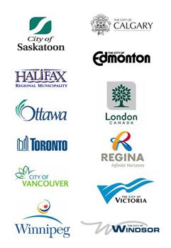
CALGARY
From the city: “Calgary’s official crest was created through a local contest and adopted in 1902. The upper-third of the crest shows the setting sun above a mural crown (symbol of loyalty) and the Rocky Mountains. The lower two-thirds bear the red cross of St. George and the Canadian maple leaf with a bison in the centre of the leaf. A horse and a steer representing Calgary’s early economy support the crest. Below the shield are the Canadian maple leaf, the leek of Wales, the shamrock of Ireland, the rose of England and the thistle of Scotland. On the scroll is Calgary’s motto ‘Onward,’ with the dates of incorporation as a town (1884) and as a city (1894). Under the scroll are the Union Jack and the Red Ensign.”
Tura’s take: “The historic crest is quite interesting with the horse and bull flanking a bison (presumably having just arrived from the hills yonder) on a maple leaf ‘carpet?’ The clovers, thistles, roses and maple leafs are also an interesting touch, and presumably a nod to the different immigrant groups who helped establish the city in the 19th century. Personally, I love the ‘onward’ slogan and if I were re-thinking the Calgary logo, I would start there as a unifying message. The current typography feels like an afterthought to the 1890s crest.”
EDMONTON
From the city: The City of Edmonton logo was developed in 1978 and designed by Hoffman Associates. A spokesperson told Metro the logo “was intended to be bold and dynamic when it was created.”
Tura’s take: “There’s really not much to admire here: the vaguely ‘Mary Tyler Moore Show’ typography doesn’t exactly express the vibrancy of a city that’s on the vanguard of energy, education and research for Canada in the 21st century. Moreover, for a city that calls itself ‘Festival City’ this wordmark doesn’t express all that much fun.”
HALIFAX
From the city: “The current Halifax Regional Municipality corporate logo was adopted by Regional Council on April 1, 1997. The logo was designed locally by Lou Cable. The logo centres around the word ‘Halifax.’ The fourth letter, being the ‘i,’ has been replaced with a lighthouse — a nautical symbol associated with the Maritimes which represents a beacon to the world. The four waves underneath the word Halifax represent each of the municipal units that were brought together under regional amalgamation in 1996.”
Tura’s take: “The ‘I’ forms a radiant lighthouse on the waterfront, see? While clearly referencing the historical character of the city and demonstrating an obvious professionalism, the logo definitely feels like it could use a bit of an update.”
LONDON
LondonFrom the city: “London is known as ‘The Forest City’ and the corporation has been using a tree in its logo for 35 years. The tree has remained similar in the different iterations but the colours have changed over the years. The current version of the logo was last re-designed in 2000. It was developed by Connections Inc., a local design firm … Currently there is a silver or grey shield behind the tree and the tree is green. Forest green represents life and silver represents opportunity.”
Tura’s take: “I suppose it makes sense that they had to put ‘Canada’ into the logo, as the Heathrow vs. 401 confusion happens all the time. Overall it’s one of the more modern-feeling city logos: the geometric patterning of the over-scaled elm leaves, the (sometimes) rounded edges of the background square, and the sans-serif typography — I’m just not sure how any of that expresses the civic spirit of London itself?”
OTTAWA
From the city: “The flag was created in 2001 when twelve municipalities amalgamated. Ottawa required a new identity that represented the new city’s dominant characteristics and population’s diversity… The stylized ‘O’ which has energy and synergy, reflecting Ottawa’s vibrancy, is the centrepiece of the flag and represents Ottawa as the nation’s capital, and was designed to have a subtle similarity to the maple leaf and Parliament buildings. The white streamers symbolize unity, harmony and working together towards a common goal. The colours of our flag reflect how Ottawa citizens feel about the quality of life and environment in our community. The blue symbolizes Ottawa’s rivers and waterways and the green area represents the abundance of green, open spaces.”
Tura’s take: “I will say that Ottawa is one of the better logos if only because it defied the urge to incorporate some abstracted image (although the ‘O’ does seem to be splashing about in the Ottawa River). This editorial act is all the more remarkable when considering the siren song of rendering the Houses of Parliament with playful brushstrokes would have been too much for most designers to resist. The interlocking ‘a’ and ‘w’ give it a feeling of togetherness, and the slight italics give it a feeling of motion — presumably of progress into the future.”
REGINA
ReginaFrom the city: “The city logo was created as part of a community branding initiative in 2010 and was created by McKim Communications. The logo is composed of an ‘R’ letterform as a distinctive focal point, unique to the city of Regina. Created with a continuous infinite loop in bold colours, the letterform is intended to position Regina as alive and vibrant — a place of endless possibility. ‘Infinite Horizons’ is an optimistic statement that speaks of opportunity expanding around the city, like the boundless prairie landscape surrounding it.”
Tura’s take: “Obviously, Regina has gone through a branding exercise recently: the infinity-symbol-cum-’R,’ the vibrant colour palette, the current typeface and the forward-looking tagline all speak to a contemporary feeling, giving the city an overall aura of progress & modernity.”
SASKATOON
From the city: The current logo was adopted in 1989 and updated in 2002. The “S” in the logo is meant to mimic the South Saskatchewan River, which flows through the centre of Saskatoon.
Tura’s take: “Ouch. Where to start? The groovy ‘S,’ the extreme italics, and the Word document typography don’t accurately represent a place that calls itself ‘POW City.’”
TORONTO
From the city: “In 1998, when the municipalities amalgamated, the city adopted the current logo … There is no specific designer’s name attributed to the final product. The graphic symbol of City Hall, an internationally recognized Toronto landmark, combines with the strong Toronto wordmark to convey both the strength and the size of the city. The association of the City Hall symbol with the Toronto wordmark suggests the supportive role of civic government to the city’s strength and growth.”
Tura’s take: “Don’t get me started! This is the only city logo to celebrate its own City Hall, while also making an emphatic statement with the bold, modern typography. It definitely feels like it comes out of a heroic, high-modernist, urban renewal tradition that the city is so keen to shed these days. I think the ‘Stronger in Unity’ message from Toronto’s historic crest says it all and could be a perfect logo for 21st-century Toronto.”
VANCOUVER
From the city: “The emblem was designed by in-house graphic designer, Elaine Ayres and unanimously adopted by Council on July 18, 2006. The city emblem captures the colours of our natural environment: blue for the sea and sky that surround our city; and green for the grass, trees and our abundant plant life. The two overlapping elements in the graphic allude to many Vancouver symbols: budding blossoms, crests of ocean waves, the peaks of mountains, birds in flight, the sails of Canada Place and the ‘V’ for Vancouver. The placement of the graphic element against the words ‘City of Vancouver’ suggests a spark or fireworks — a city that is alive and growing.”
Tura’s take: “Maybe they could borrow the WhiteCaps logo, which I think is one of the nicest in all of professional sports: the mountains, the water, the clean, modern typography, none of which is present here of course.”
VICTORIA
From the city: “The V-banner logo is a strong, highly visible mark that presents a subtle ‘V’ for Victoria. It presents a warm, welcoming, vibrant, celebratory and proud image to the nation and the world, enhancing and modernizing the city while suggesting timeless elements of its history, such as waves, mountains and ocean breezes. The V-banner logo was selected in 2001 because it evokes positive associations with the City of Victoria, combining timeless elements of the city’s past and present, and positioning it for the future.”
Tura’s take: “Clearly there’s a disconnect between what is one of Canada’s most beautiful cities and this ‘flying-V’ logo.”
WINDSOR
From the city: “The short story on the ‘W’ logo is that we wanted to have a second, less formal logo to put on correspondence and vehicles, etc., that was a little newer and fresher, and in a nice appealing, straightforward design that identified the city. There are slight twists on the ‘W’ design that add in ‘Ontario, Canada’ underneath. We use that version on material of a more national interest.”
Hunter’s take: “Another tough one. While it’s obvious they want to accentuate the ‘W,’ unfortunately the script letterform looks like it was drawn with the free-hand tool in PowerPoint.”
WINNIPEG
From the city: “The new logo was unveiled on January 18, 2001 and designed by Deschenes Regnier. The logo was meant to build on the city’s core values: generosity, diversity, and entrepreneurship. The rich palette of colours respects Winnipeg’s distinct Aboriginal heritage while evoking our strong connection to the four seasons and the elements: water, air, fire and earth.”
Metro
2163 page views
|
|
|
|